Last updated: April 09, 2024
Types of data quality dashboards
Read this guide to learn what kind of data quality dashboards are bundled with DQOps, what is their purpose, and how they allow to find affected tables.
Overview
DQOps has multiple built-in data quality dashboards for displaying data quality KPI. Our dashboards use Looker Studio (formerly Google Data Studio) business intelligence environment. We chose Looker Studio because there is no per-user license fee, which allows granting access to all parties that might be involved in the issue resolution process.
All data quality results are synchronized to a private data quality data warehouse in the Google Cloud. Data quality projects implemented with DQOps receive a complementary Looker Studio instance connected to a data quality data warehouse. DQOps customers can ask the vendor to access a custom Looker Studio data source, providing direct access to the data quality lakehouse.
Complimentary data quality data warehouse for FREE accounts
DQOps provides a complimentary data quality data lake and data quality data warehouse for users who are using a FREE license of DQOps Cloud.
Due to capacity constraints, a limited number of new users who register a FREE DQOps Cloud account are granted access to the data warehouse, allowing them to synchronize data quality results with the data quality data warehouse and use the data quality dashboards for free. New grants are released every day.
Navigating dashboards
To view dashboards, simply go to the Data Quality Dashboard section, and select the dashboard of interest from the tree view on the left. There are several groups and subgroups of data quality dashboards dedicated to analyzing results from data quality checks.
For example, to review the summary KPIs of all executed monitoring checks you can use the KPIs scorecard - summary dashboard. You can find it in the Monitoring group, Data quality KPIs subgroup.

When you hover over the name of the dashboard in the tree view, thumbnails are displayed to help you identify the type of dashboard.
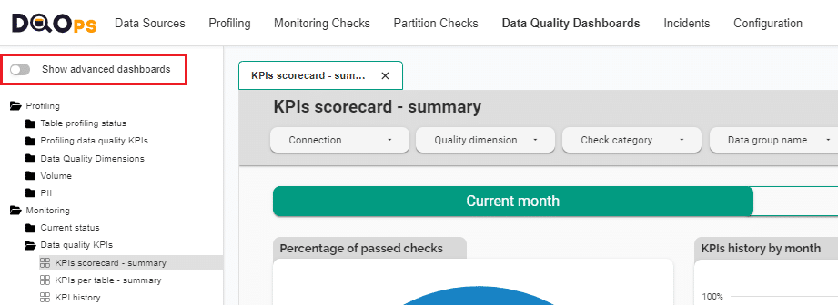
Switching view between basic and advanced dashboards
In DQOps the dashboards are divided into two groups: basic and advanced dashboards.
The toggle button Show advanced dashboards at the top of the tree view allows to toggle between displaying only basic dashboards or both basic and more advanced dashboards.
Filtering
On each dashboard, data can be filtered. You can filter data by clicking on the dropdown buttons located on the dark gray top part of the dashboard, or clicking on the elements in the tables such as the Connection, Schema, Dimension, Data group, etc. Some dashboards have additional filtering options such as checks boxes or input fields.

The following example shows the filtering of data by a connection named bigquery-public-data after clicking on it.
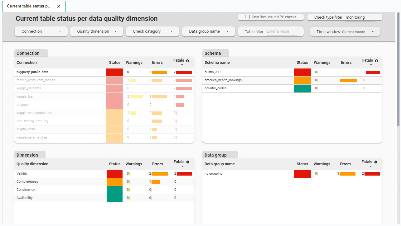
Data on dashboards is displayed for a specific time range, most often for the current month. Depending on the type of dashboard, you can change the specific time range using Time window dropdown button located on the top part of the dashboard.
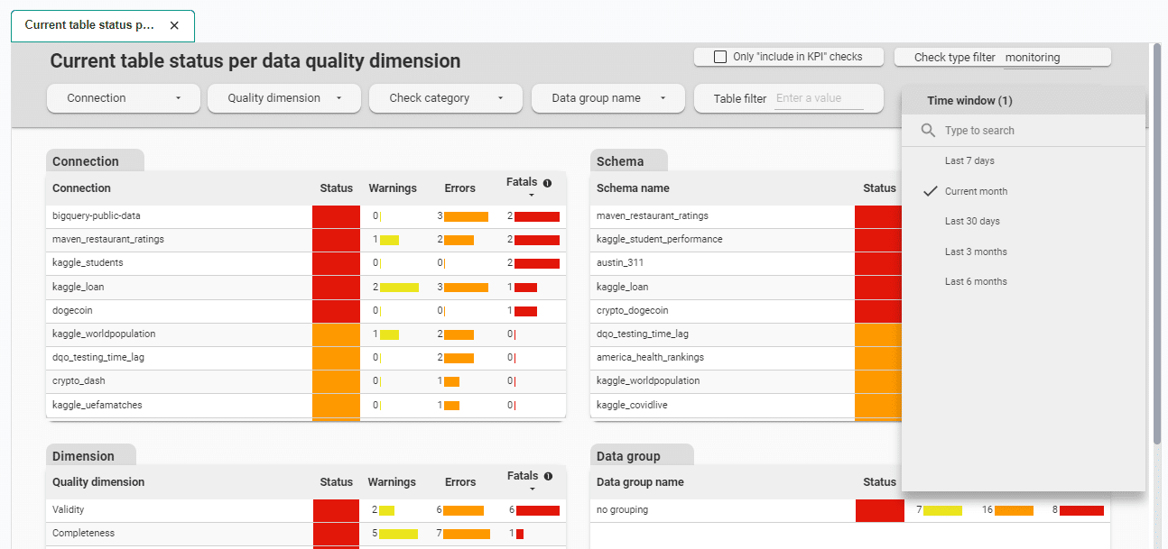
Other dashboards have buttons to change the view between the current and previous month.

Profiling, Monitoring, and Partitions groups
Profiling, Monitoring, and Partitions groups each contain subgroups for analyzing results from profiling, monitoring, and partition check types, respectively.
Profiling checks are useful for exploring and experimenting with various types of checks and determining the most suitable ones for regular data quality monitoring. When the profiling data quality check is run, only one sensor readout is saved per month. That is why profiling group does not have dashboards displaying data per day of the month or histograms.
Monitoring checks are standard checks that monitor the data quality of a table or column. There are two categories of monitoring checks: daily checks and monthly checks. The daily monitoring checks store the most recent sensor readouts for each day when the data quality check was run. This means that if you run a check several times a day only the most recent readout is stored. The previous readouts for that day will be overwritten.
Partition checks are designed to measure the data quality in partitioned data. In contrast to monitoring checks, partition checks produce separate monitoring results for each partition. There are two categories of partition checks: daily checks and monthly checks. The daily partition checks store the most recent sensor readouts for each partition and each day when the data quality check was run. This means that if you run check several times a day only the most recent readout is stored. The previous readouts for that day will be overwritten.
Below are the list of major subgroups within Profiling, Monitoring, and Partitions groups
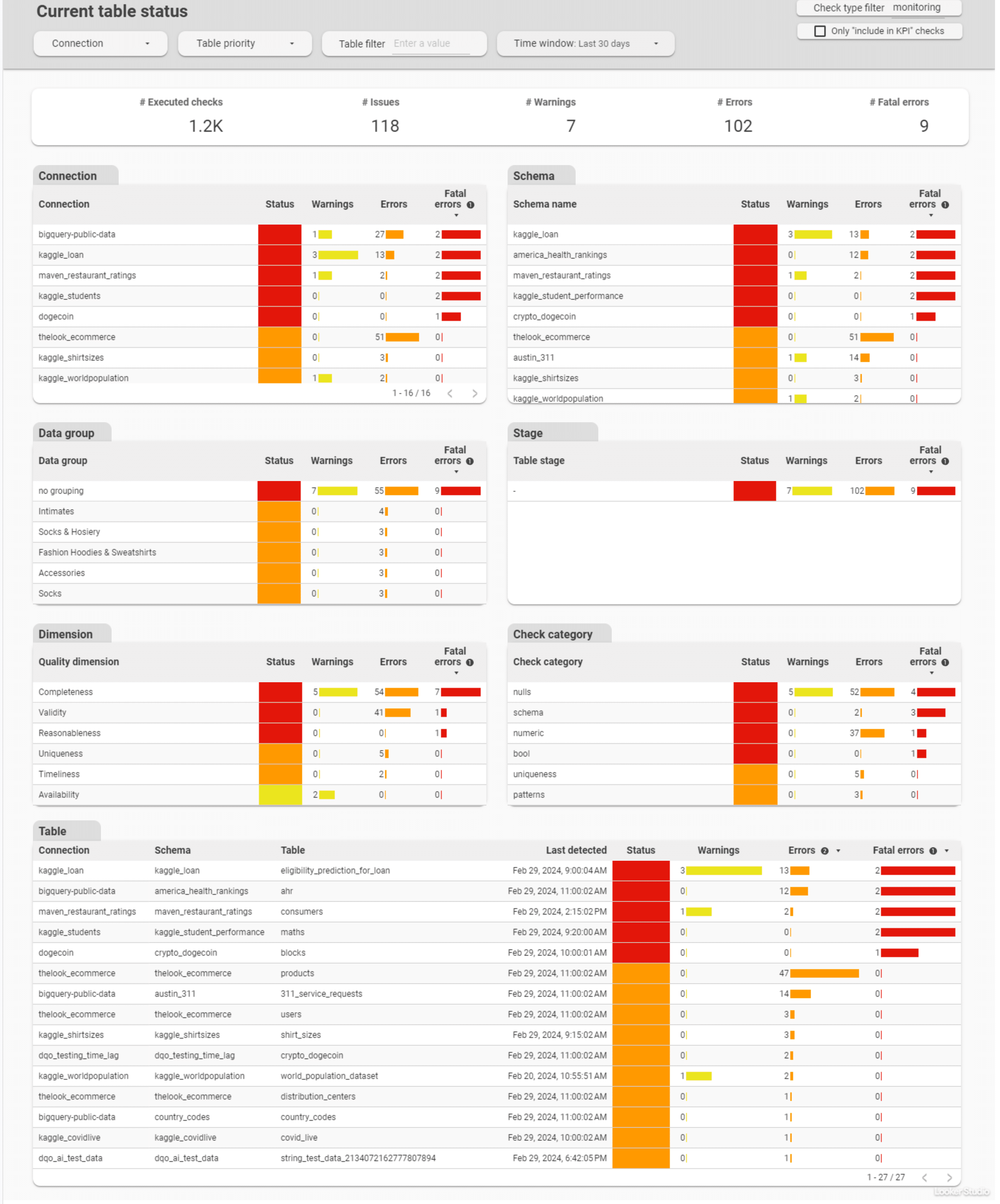
Current status
Current status dashboards allow data engineers and data owners to quickly evaluate the data quality of monitored tables and columns. The dashboards display a color-coded status that indicates the severity level detected by run checks. When the status is green, it means that the monitored column has no data quality issues. However, if the status is yellow, orange, or red, it indicates that there were some issues detected. The dashboard also displays the number of detected issues per severity threshold, making it easier to identify and address tables and columns with issues.
These dashboards allow filtering data by:
- time frame,
- connection,
- priority
- schema,
- data group
- stage
- data quality dimension,
- check category,
- table,
- column.
Current table status dashboard is a representative of this group.
Highest issue severity per day
Highest issue severity per day advanced dashboards allow for reviewing and filtering a summary number of issues that arise from data quality checks per day. Depending on the dashboard, the summary is grouped by table, column, data grouping, or check category. These dashboards help evaluate the areas with the highest number of data quality issues that should be addressed. It also allows to review how the issue severity changed per day of the month.
These dashboards allow filtering data by:
- current and previous month,
- connection,
- schema,
- data group,
- data quality dimension,
- check category,
- check name,
- table,
- column.
Highest issue severity per table and day is a representative of this group.

Data quality issues count
Data quality issues count advanced dashboards allow evaluation of the number issues and its severity level per table, or per check category. Another two types of dashboards in this subgroup allows reviewing the total number of failed checks (warning, error, fatal) per day of the month, or per table and day of the month.
Data quality failed checks per table and day is a representative of this group.
This dashboard allows filtering data by:
- severity
- current and previous month,
- connection,
- schema,
- stage
- priority,
- data group,
- data quality dimension,
- check category,
- check name,
- table,
- day of the month.

Data quality KPIs
Data quality KPIs dashboards show high-level data quality KPIs, aggregated on a macro scale that can be shared at a corporate level. DQOps calculates data quality KPIs as a percentage of passed data quality checks for each connection, schema, data grouping, etc.
With these dashboards, senior management can review a summary of data quality KPIs or evaluate the KPIs per table, column, data quality dimensions, check category, data grouping and day.
KPIs per table and day is a representative of advanced dashboards in this group. It allows reviewing data quality KPIs per table and day of the month.
This dashboard allows filtering data by:
- current and previous month,
- connection,
- schema,
- data group,
- stage,
- priority,
- data quality dimension,
- check category,
- check name,
- column
- table,
- day of the month.

Check results
Check results advanced dashboards allow to review the details of the executed checks results.
History of data quality check results is a representative of this group. This dashboard displays all executed checks run on tables and columns and allows reviewing their set parameters, as well as actual and expected values.
This dashboard allows filtering data by:
- time window (from last 7 days to last 6 months)
- connection,
- schema,
- data group,
- data quality dimension,
- check category,
- stages,
- priorities,
- table,
- column,
- check name,
- issue severity
- day

Data Quality Dimensions
Data Quality Dimensions group contains dashboards dedicated for different data quality dimension such as availability, completeness, or timeliness.
Availability, Completeness, and Validity dimensions has at least two dashboards. Basic dashboard dedicated to reviewing current issues and the advanced dashboard for reviewing the history of issues.
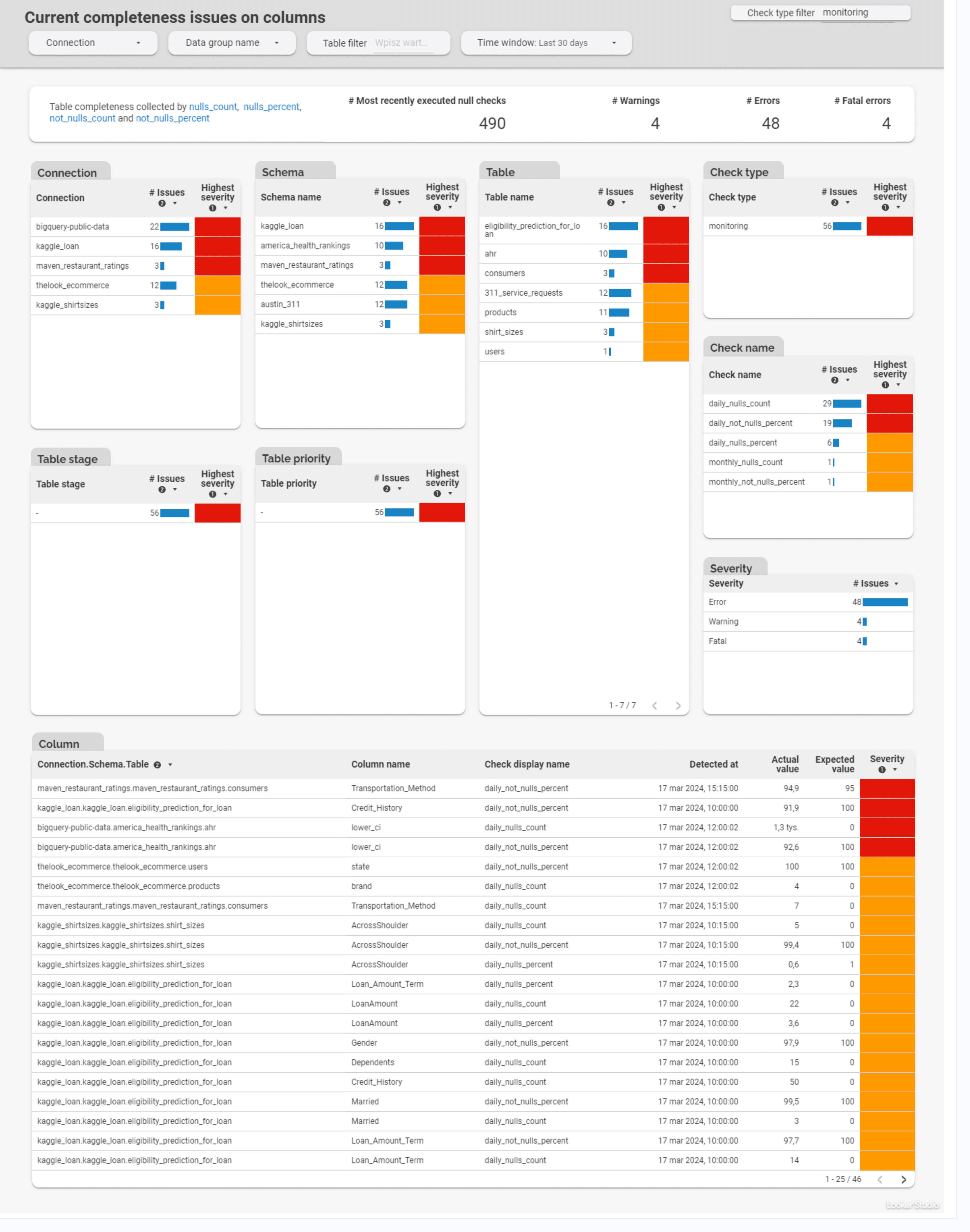
Current completeness issues on columns is a representative of Completeness subgroup. This dashboard summarizes results from most recently executed null checks on columns (null_count, null_percent, not_nulls_count and not_nulls_percent).
This dashboard allows filtering data by:
- time window (from last 7 days to last 3 months)
- connection,
- schema,
- data group,
- check category,
- check name,
- stages,
- priorities,
- table,
- column,
- issue severity.
Timeliness dimensions has specialized dashboards for evaluating:
- Current timeliness issues
- History of timeliness issues
- Table freshness - tables with the most current data,
- Table freshness - tables with the oldest data,
- Table staleness - tables most recently loaded
- Table staleness - tables no longer loaded
- History of table freshness
- Minimum, maximum and average delay
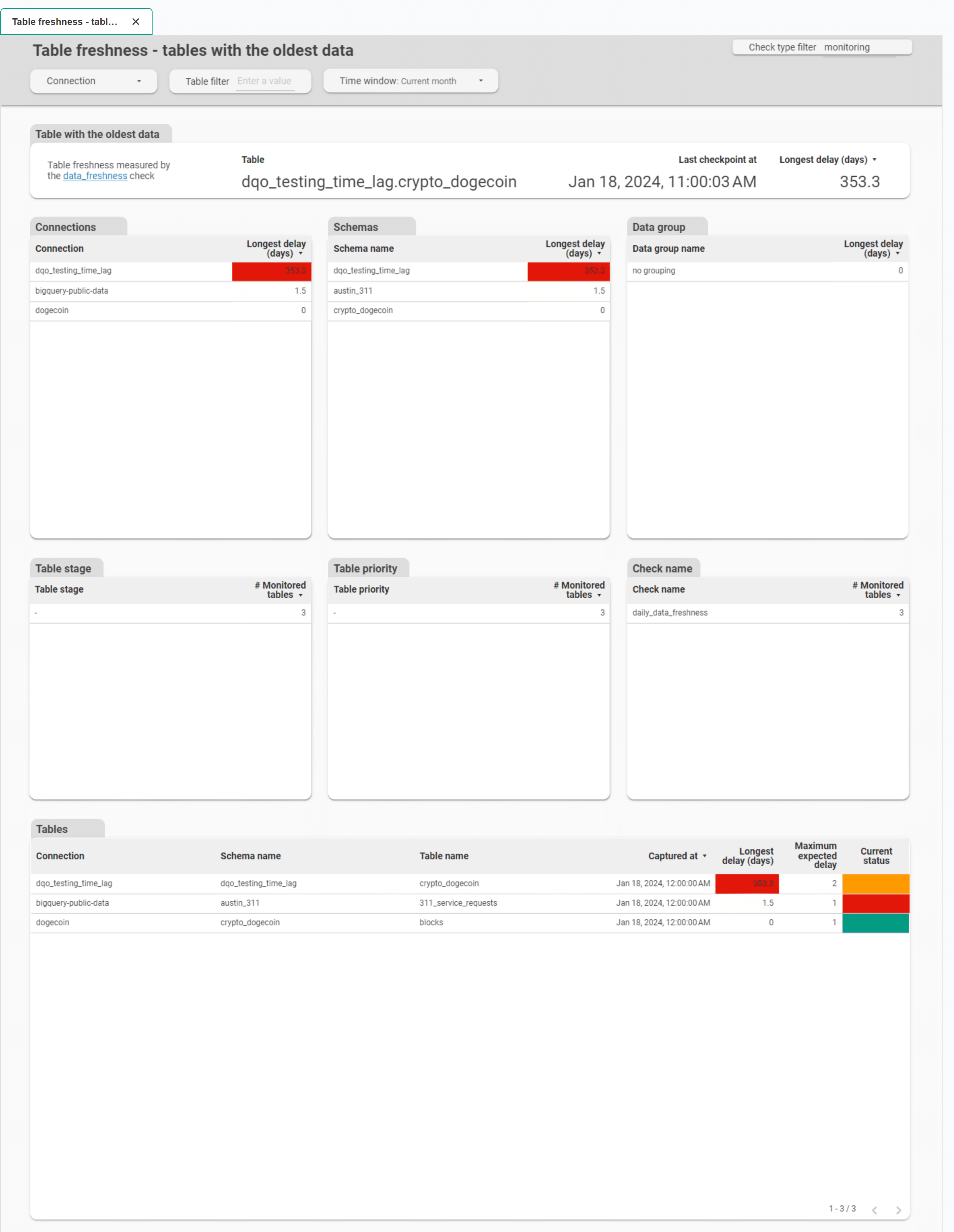
Table freshness - tables with the oldest data is a representative of Timeliness subgroup. This dashboard summarizes tables with the longest delay measured by the table_freshness check.
This dashboard allows filtering data by:
- time window (from last 7 days to last 3 months)
- connection,
- schema,
- data group,
- stages,
- priorities,
- check name,
- table.
Volume
Volume dashboards in the Monitoring group help to evaluate the largest tables by number of rows and empty or too small tables. While dashboards in the Partitions group (Partition volume statistics) display daily partitions row count and too small partitions.
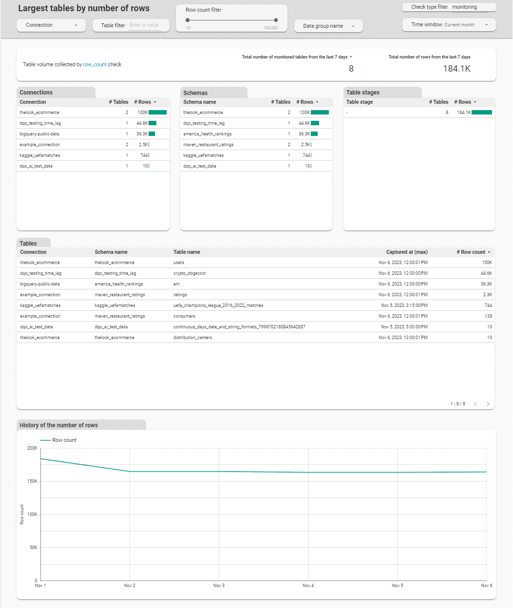
Largest tables by number of rows is a representative of Volume subgroup. This dashboard displays tables monitored with row_count check and allows review the number of rows in these tables.
This dashboard allows filtering data by:
- time window (from last 7 days to last 3 months)
- row count
- connection,
- schema,
- data group,
- stages,
- table.
PII
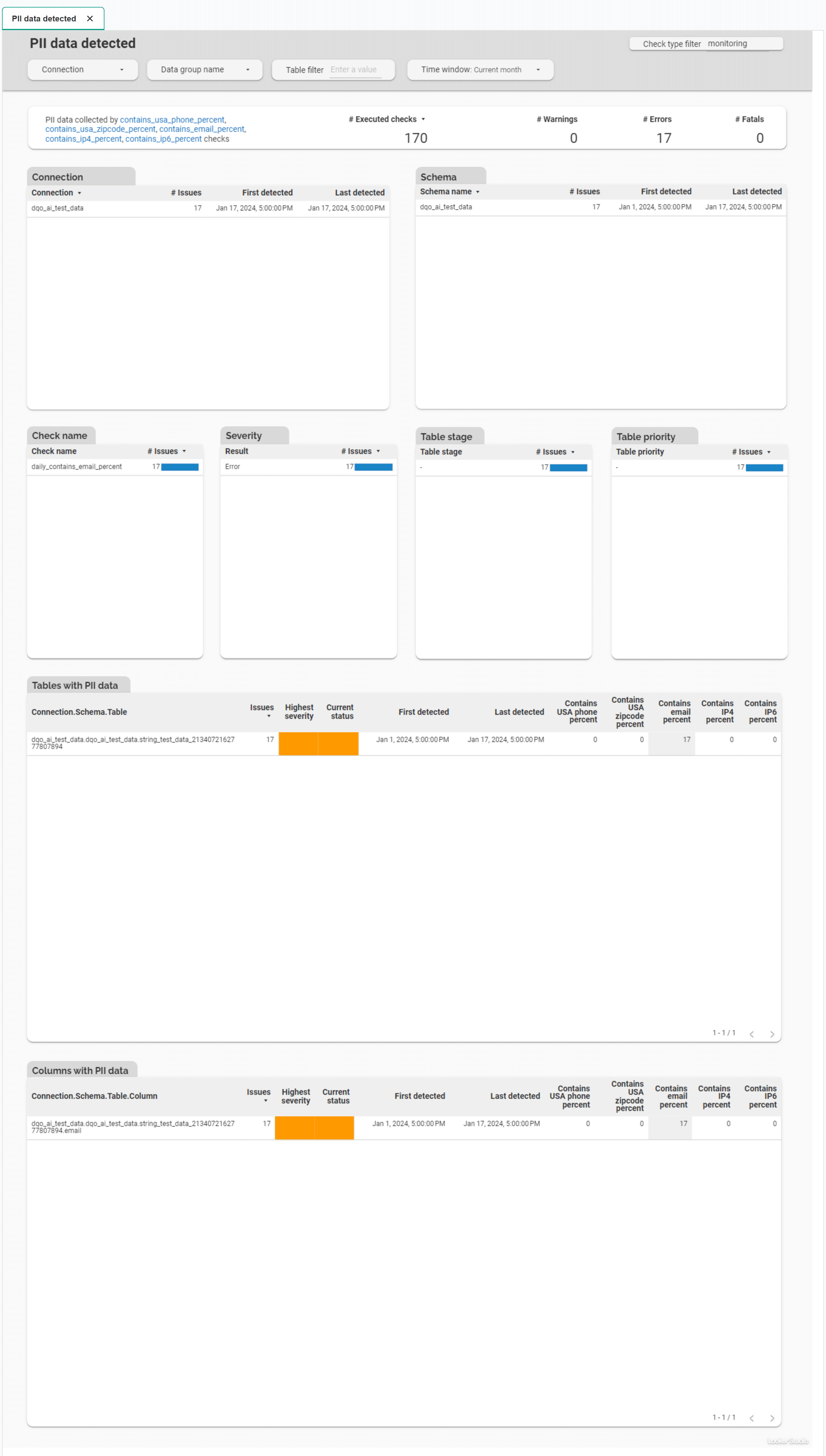
PII dashboards display results from column checks detecting the percentage of Personal Identifiable Information in data. PII includes phone numbers (contains_usa_phone_percent), emails (contains_email_percent), zipcodes (contains_usa_zipcode_percent), or IP addresses (contains_ip4_percent, contains_ip6_percent).
PII data detected dashboard is a representative of PII subgroup. This dashboard displays columns monitored with PII checks mentioned above.
This dashboard allows filtering data by:
- time window (from last 7 days to last 6 months)
- connection,
- schema,
- data group,
- check name,
- severity
- stages,
- priority,
- table,
- column.
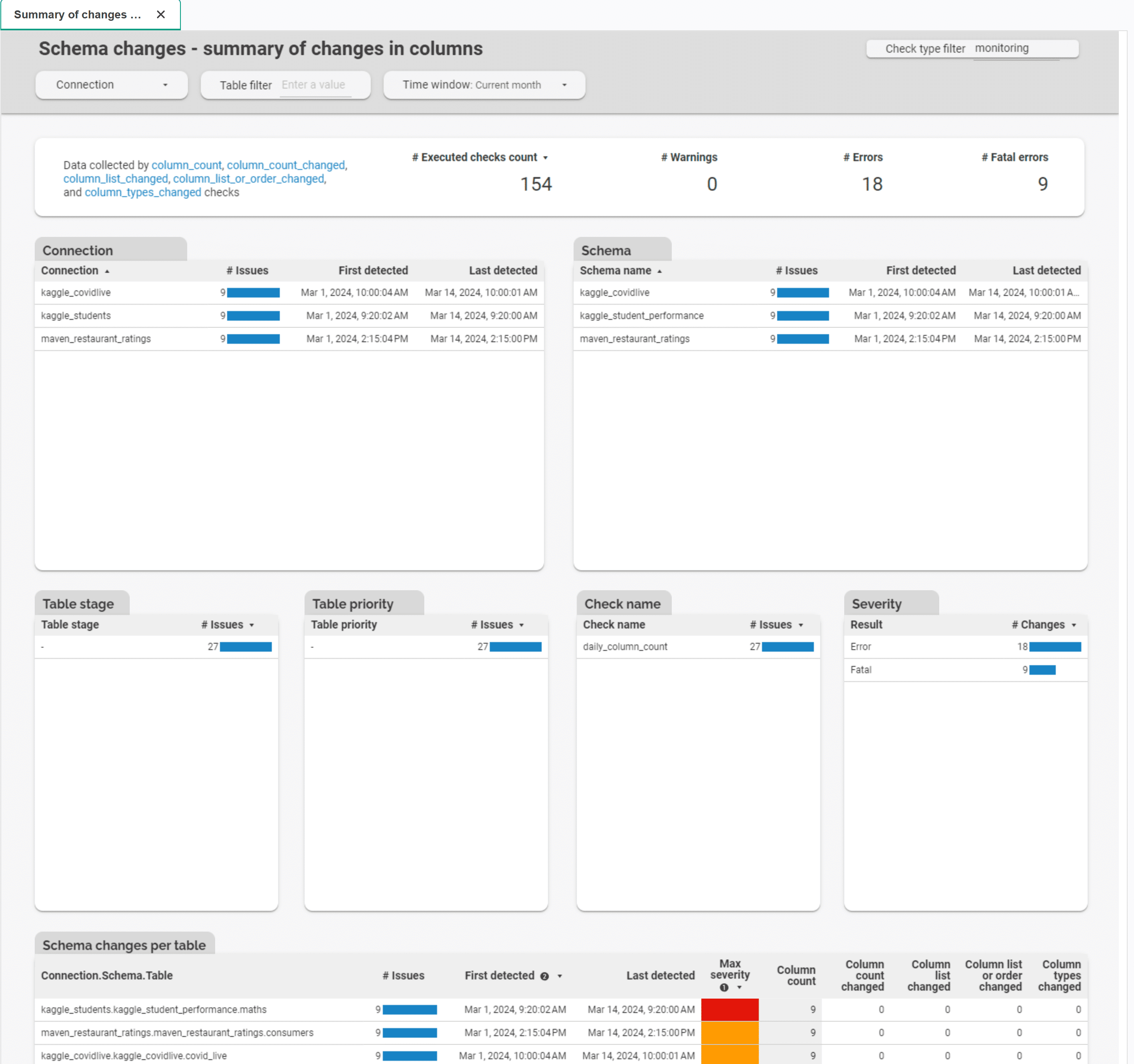
Schema changes
Schema changes dashboards allow to view tables with schema change issues. There are several dashboards dedicated to schema change: * Table-level issues - Summary of changes in columns - Expected vs actual column count - Column count changed - Column list changed - Column list or order changed - Column types changed * Column-level issues - Column exists - Column type changed
Summary of changes in columns is a representative of Schema changes group. This dashboard summarizes issues obtained from all table-level schema change checks (column count, column count changed, column list changed, column list or order changed,, column types changed).
This dashboard allows filtering data by:
- time window (from last 7 days to last 6 months)
- connection,
- schema,
- stages,
- priorities,
- check name,
- severity
- table.
DQOps usage
DQOps usage group contains dashboards summarizing executed checks, executed errors and checks no longer in use.
Statistics of executed checks
Statistics of executed checks subgroup of dashboards contains summaries of executed checks per table, column, data grouping, and check category.
Execution errors
Execution errors dashboards allow to view details and history of execution errors.
Details of execution errors is a representative of this group. It allows to view detail source of the error (table, column and check), time when the error occurred and detailed error message. It also displays daily distribution of errors.
This dashboard allows filtering data by:
- time window (from last 7 days to last 6 months)
- connection,
- schema,
- data group,
- table,
- column,
- dimension,
- check type,
- check category,
- check name.

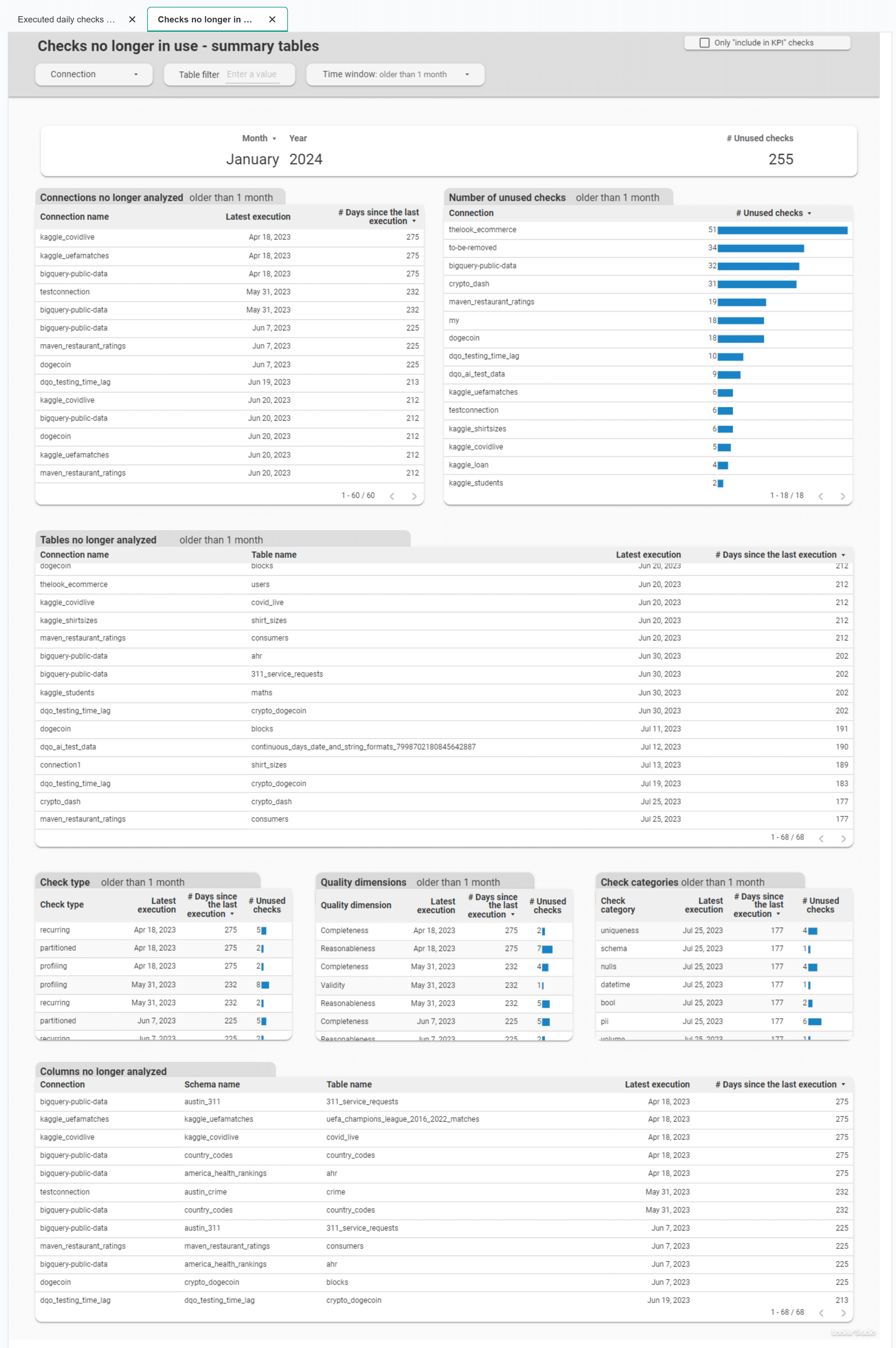
Checks no longer in use
Checks no longer in use - summary table dashboard shows summary tables of checks that are no longer in use.
This dashboard allows filtering data by:
- time window (older than one month to older than a year)
- connection,
- table,
- column
- check type,
- quality dimension,
- check category.
What's next
- Check the Data quality KPIs concept guide, to learn how to measure the data quality KPI score with DQOps, what is the formula used to calculate the score, and how to improve data quality KPIs.
- DQOps allows you to create custom data quality dashboards using Looker Studio. Check the guide to learn more.
- You might also be interested in learning how to use data quality dashboards.